Fucking Young! 25 Issue

- Cordoba Canillas
- 2024
- Editorial Design
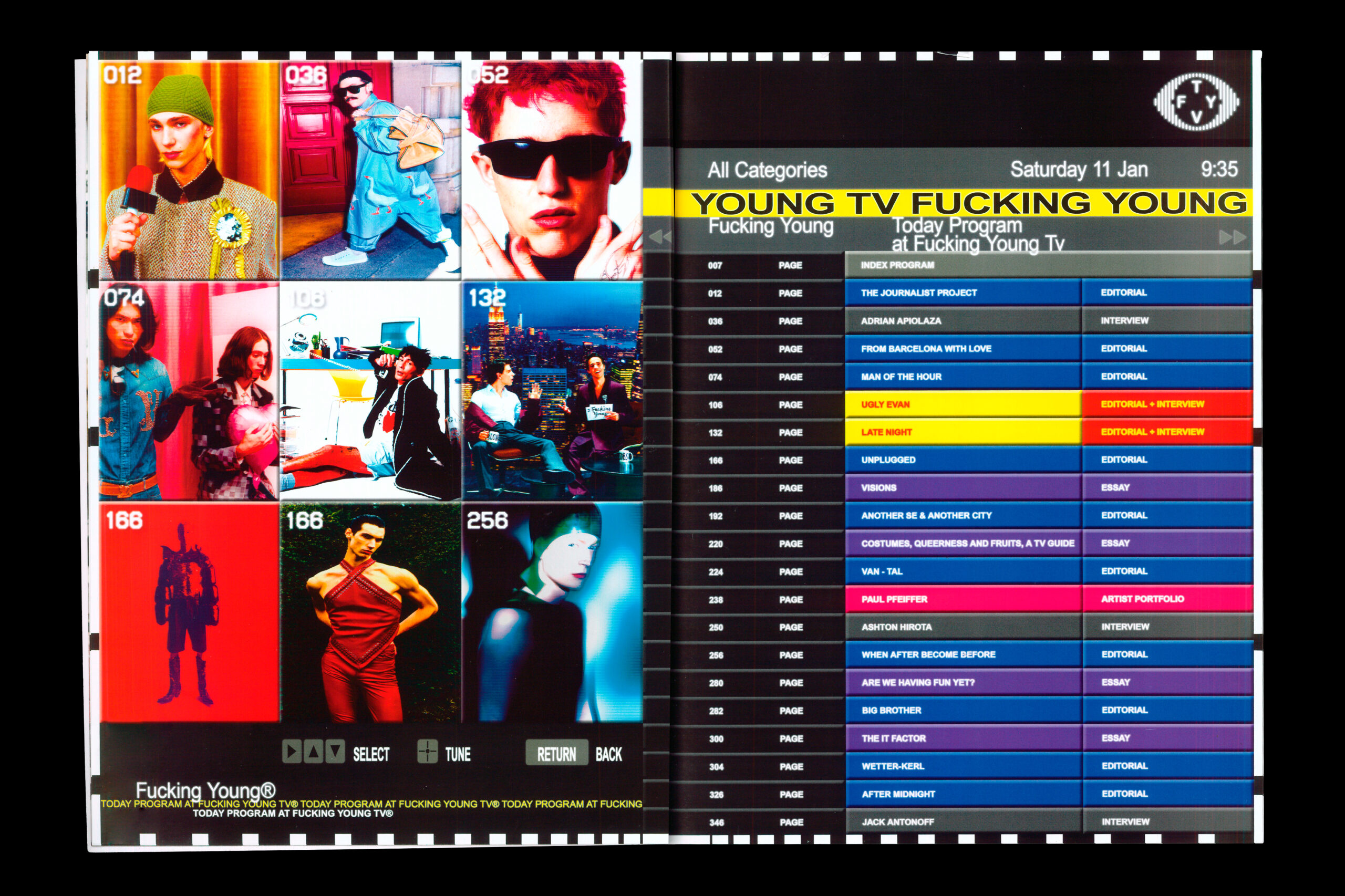
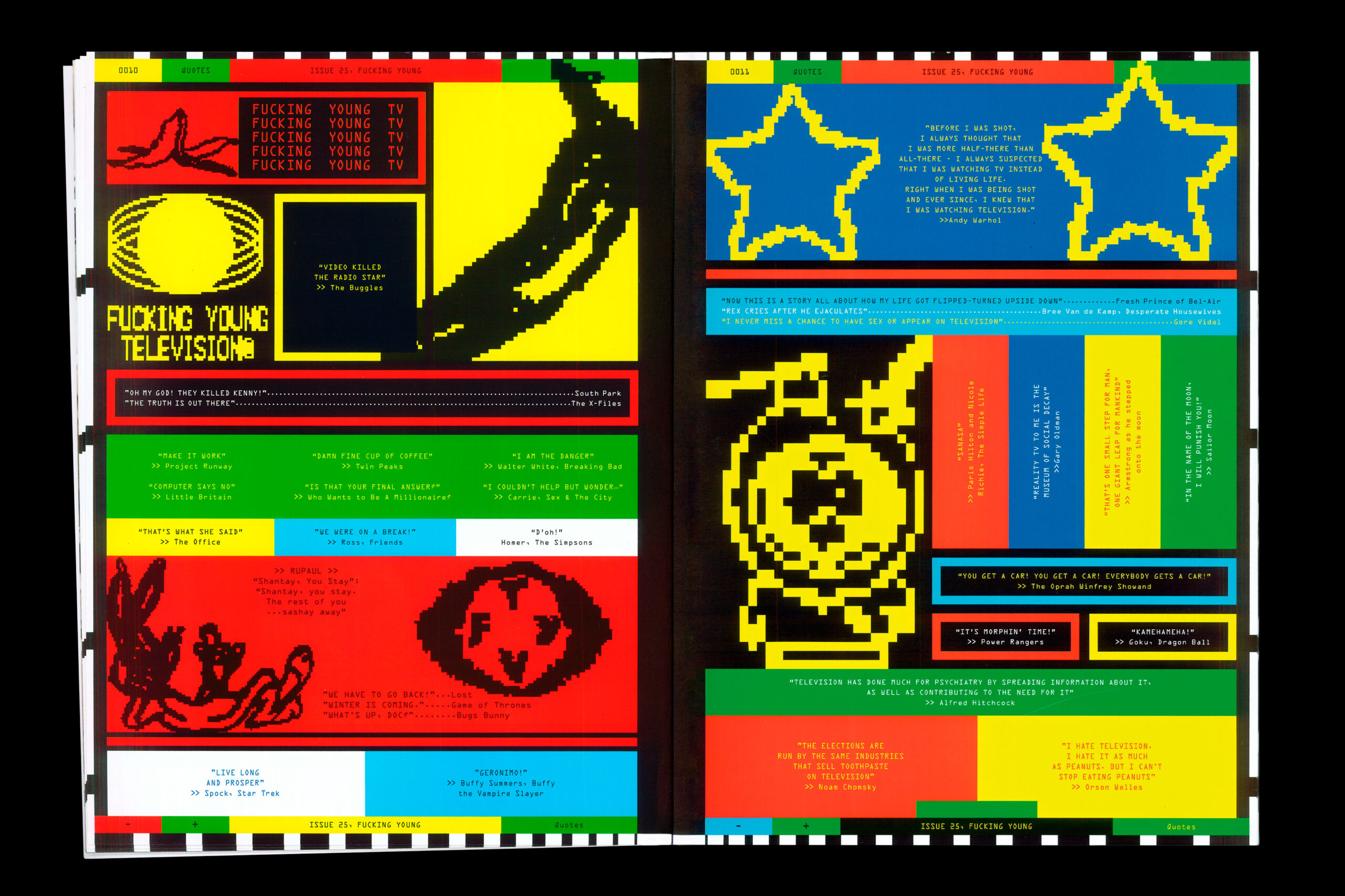
The 25th issue of Fucking Young! magazine, themed around television, takes a distinct design approach inspired by the visual language of television itself. Specifically, the design draws on elements like teletext and TV indexes, suggesting a retro or perhaps deconstructed aesthetic. This likely translates to visual layouts, typography, and graphic elements that evoke the look and feel of television interfaces. This design choice connects the magazine’s theme to its visual presentation, creating a immersive experience for the reader.
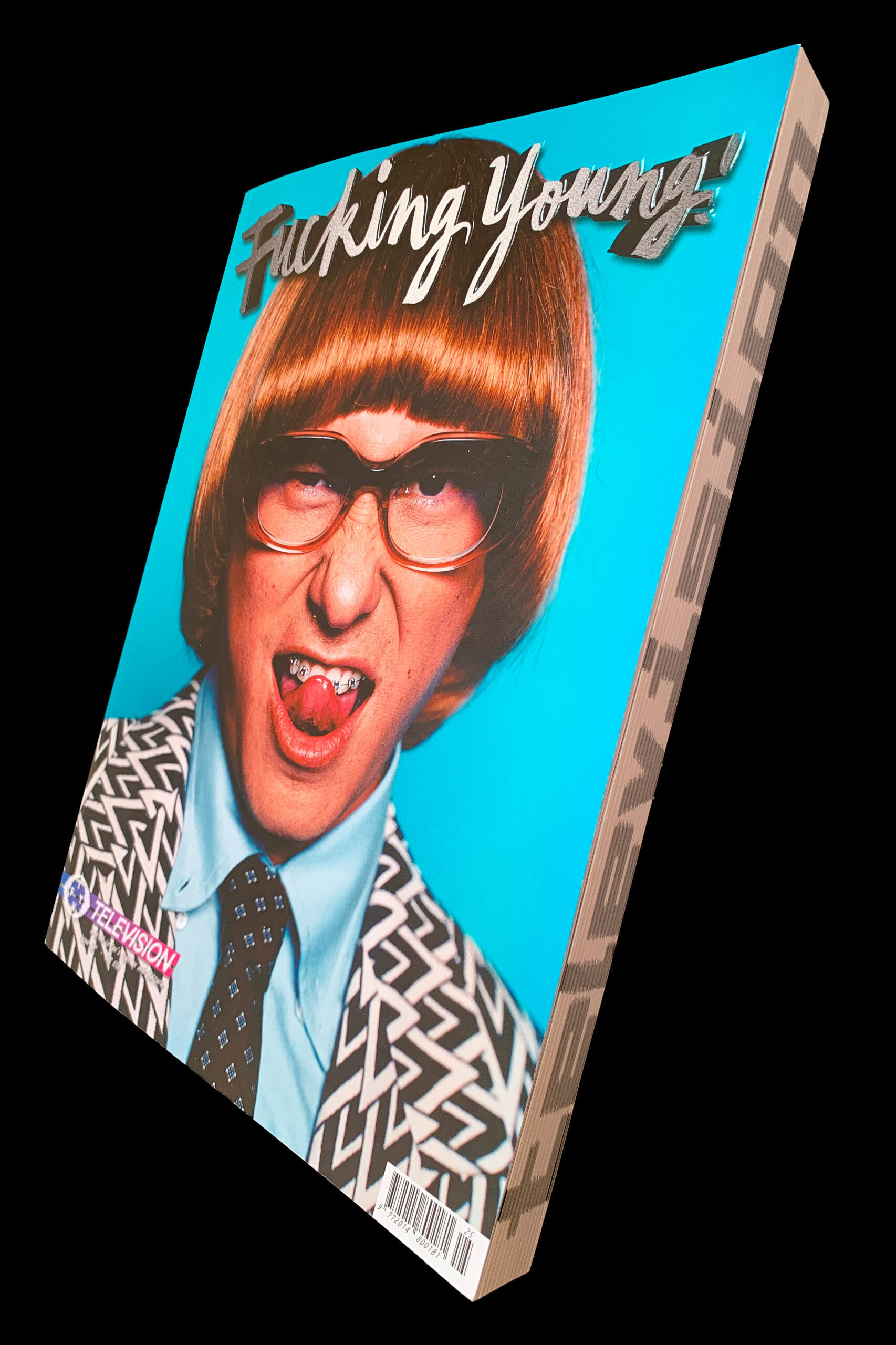
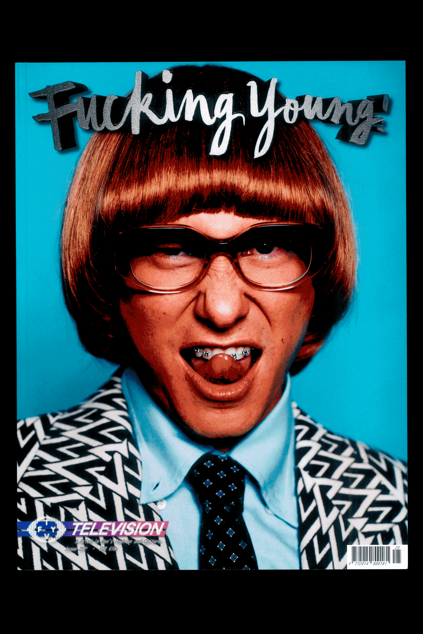
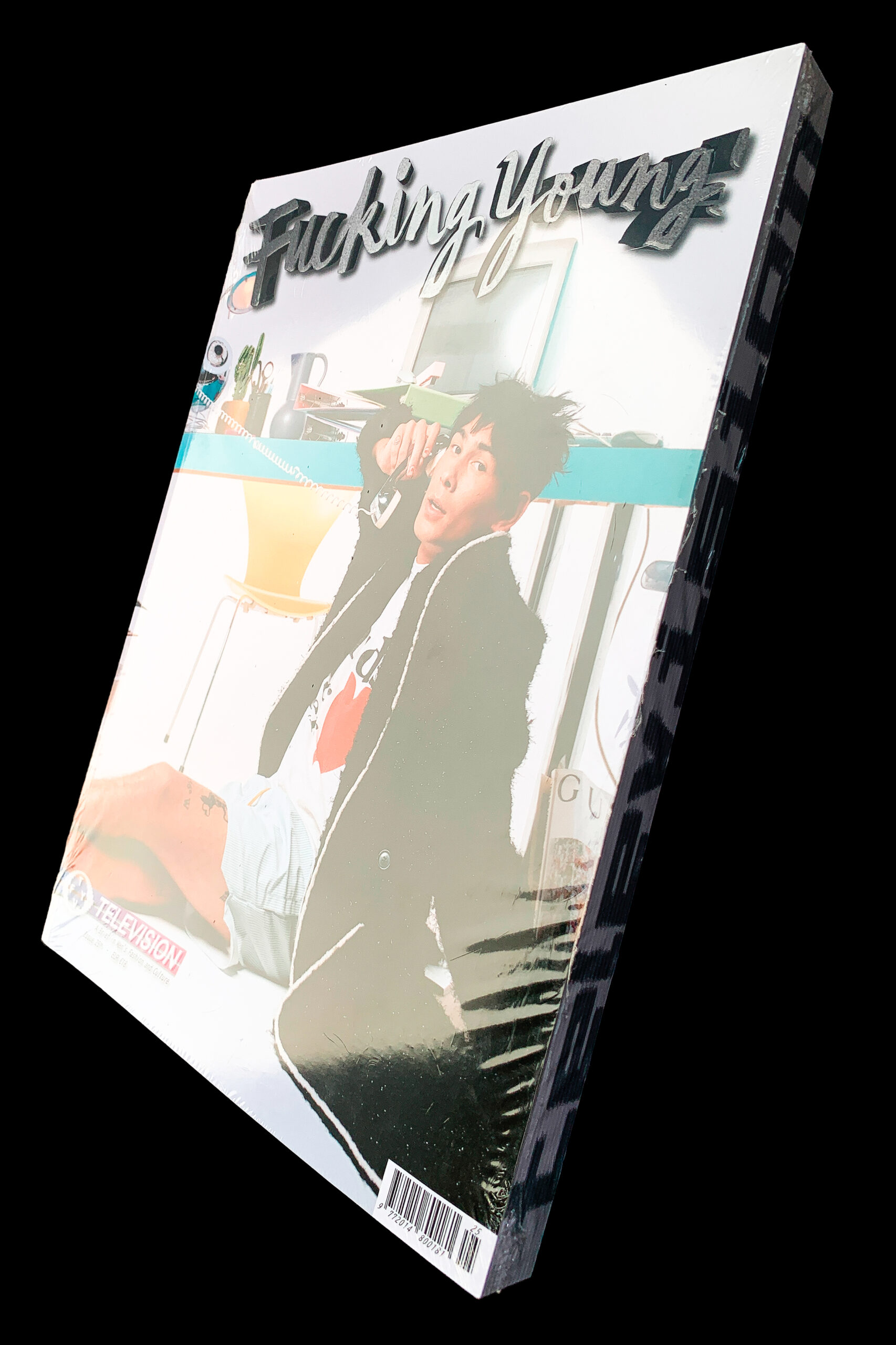
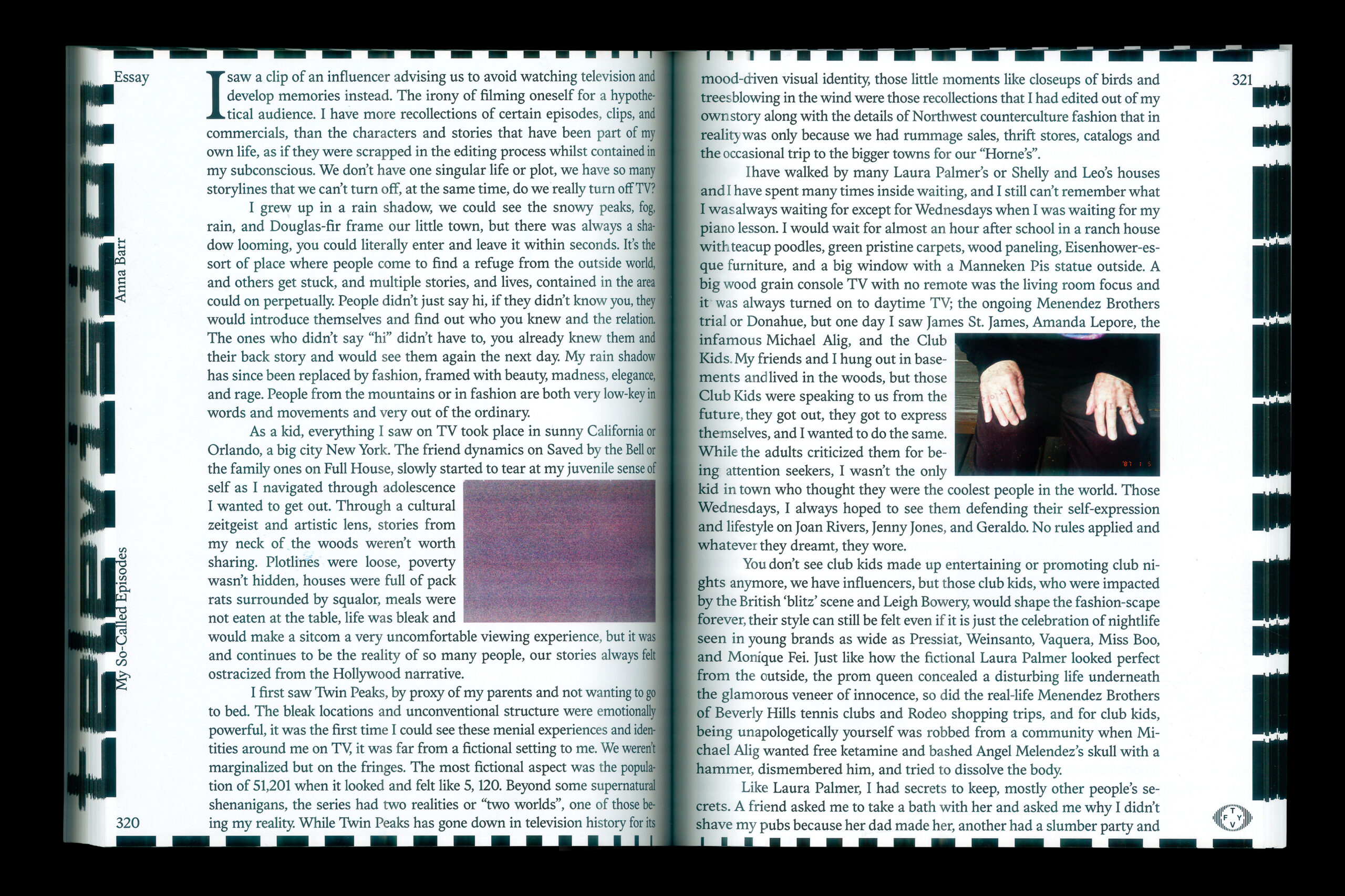
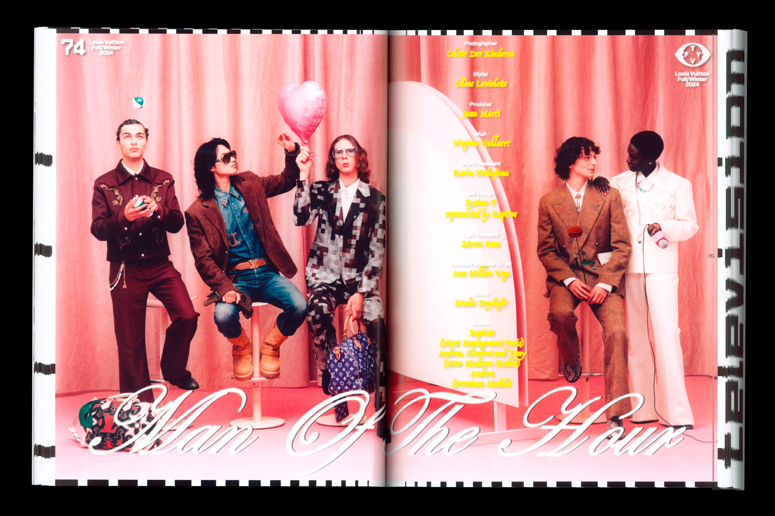
Beyond the design, the content explores the multifaceted impact of television on our culture and memories. The content delves into broader themes of representation, the evolution of entertainment, and the power of TV to influence social change. The issue features a mix of celebrity and creative talent, including Evan Mock on the cover (in a shoot inspired by «Ugly Betty»), interviews with designers and musicians, and contributions from a diverse group of photographers. This blend of fashion, interviews, and artistic photography, all filtered through the lens of television, promises a rich and engaging exploration of the theme.
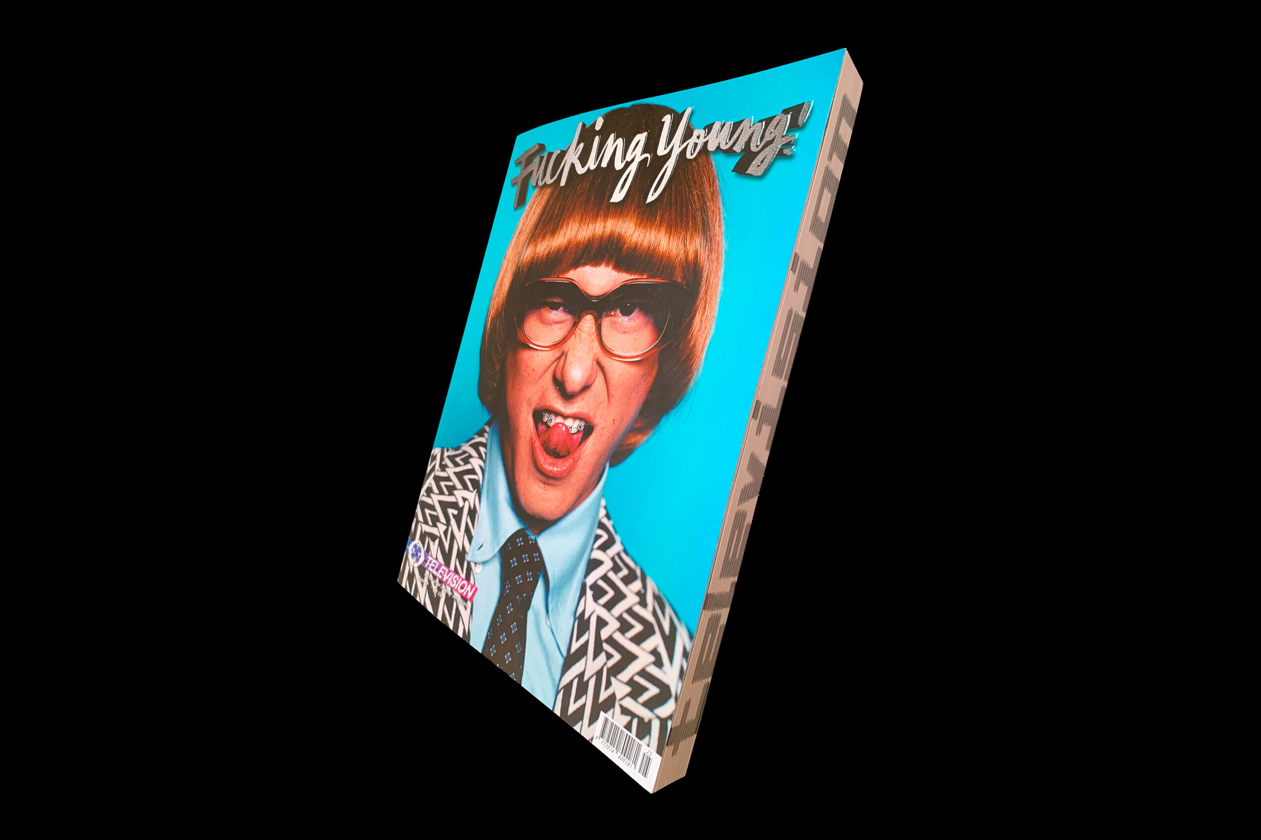
The Fucking Young! magazine cover employs several printing techniques, including a collage or montage effect, edge text that spells out «Television,» a special silver ink, and embossing. The issue is available with three different cover variations. This edition comprises 373 pages, featuring interviews, editorials, advertisements, quotes, an editor’s letter, an index, essays, and an artist portfolio.
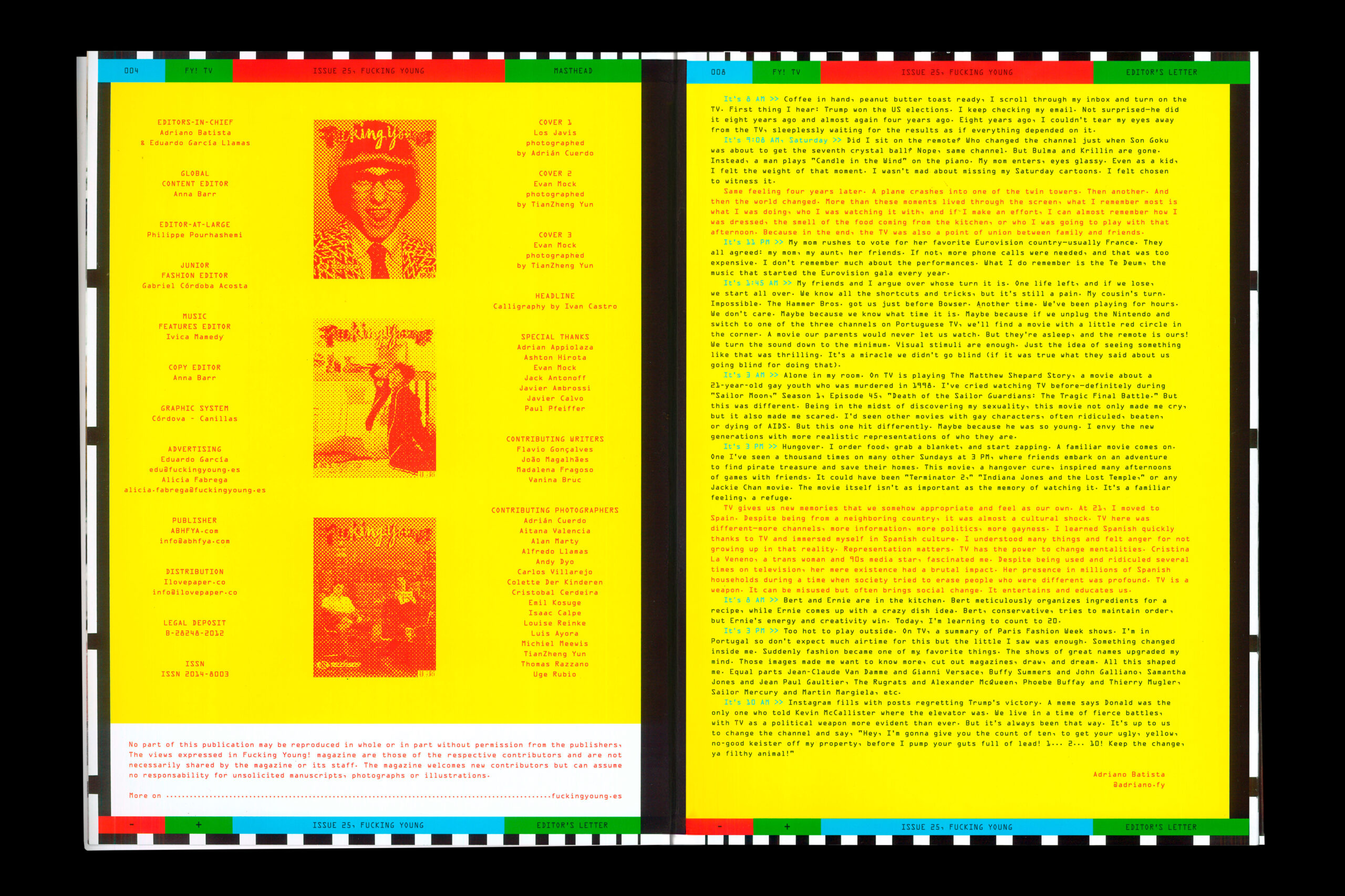
Overall, the design is successful in creating a strong visual impact and immediately communicating the issue’s focus on television. It’s playful and conceptually driven, transforming typically text-heavy sections (editor’s letter and quotes) into a visually engaging experience. By presenting these elements in such a visually compelling and thematically relevant way, Fucking Young! effectively immerses the reader in the issue’s world from the very beginning. It’s a strong example of how design can elevate content and create a cohesive reading experience. The shaped, constrained text, applied consistently across both the editorial introduction and the quotes, is essential to this success, pushing beyond mere pixelation to replicate the true teletext experience and creating a unified sense of a specific television era.