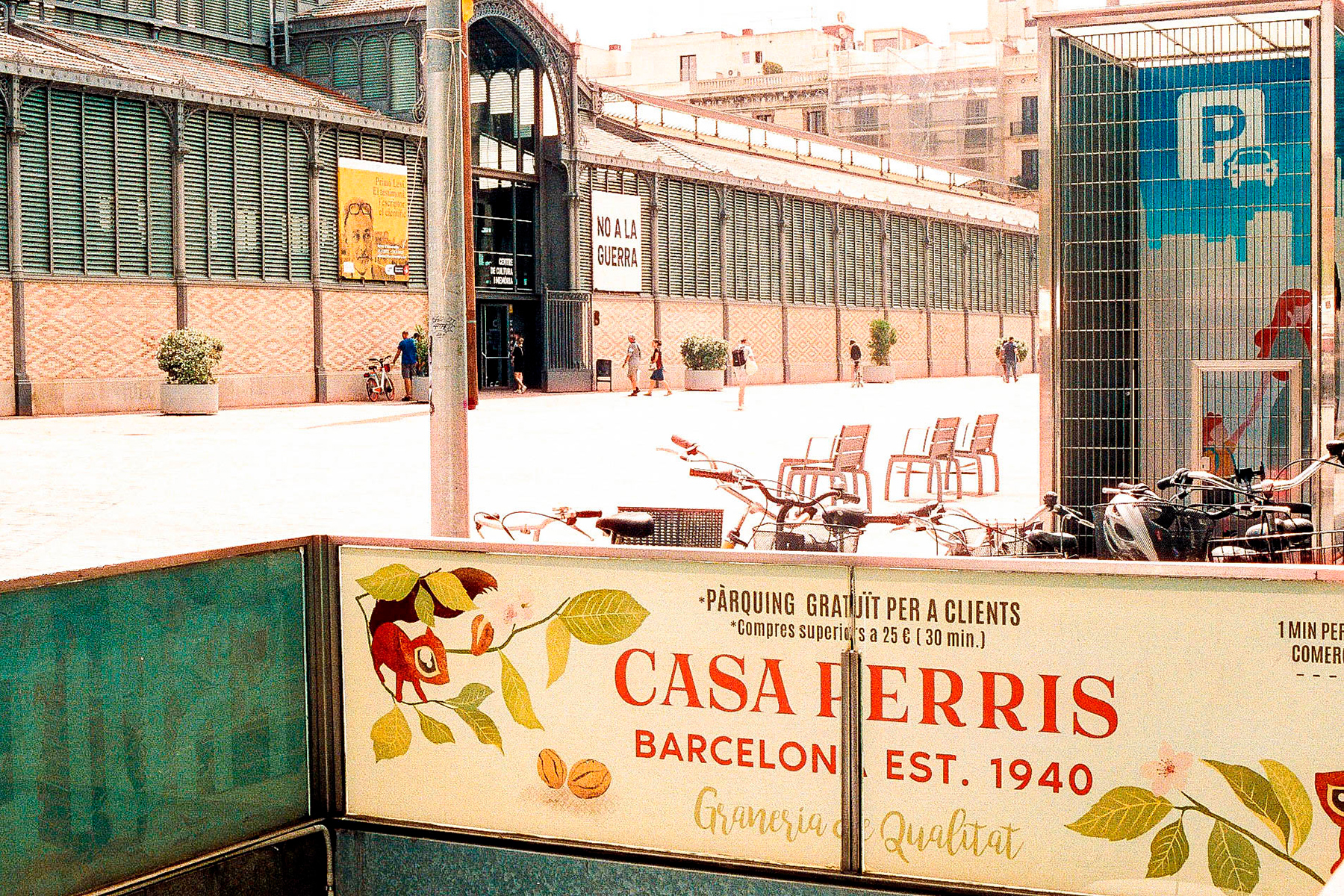
Casa Perris bulk store has been providing high-enId food items in Barcelona city centre since 1940. Casa Perris rebranding was about designing and implementing a brand renewal of the brand image of the store in all graphical areas. Logo, packaging, stationery and all the internal and external marketing materials, including new web sit and social media. For the web and social networks we decided to give a fresh and more fun touch that encompasses the more traditional design of the store and a more modern design for the online audience. In general, it is a facelift suitable for all age ranges of the public.
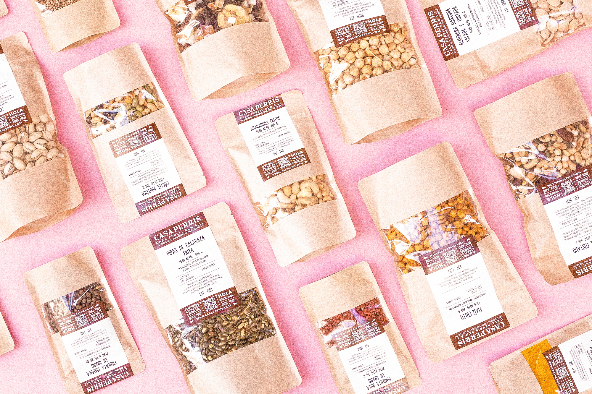
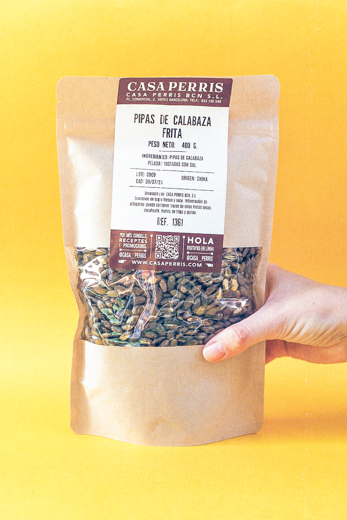
My main focus has been to preserve the history of the brand and retro image while using environmentally responsible materials. Throughout the designs I have used hand painted designs. It has been comforting to see the warm and harmonious results. @casa_perris
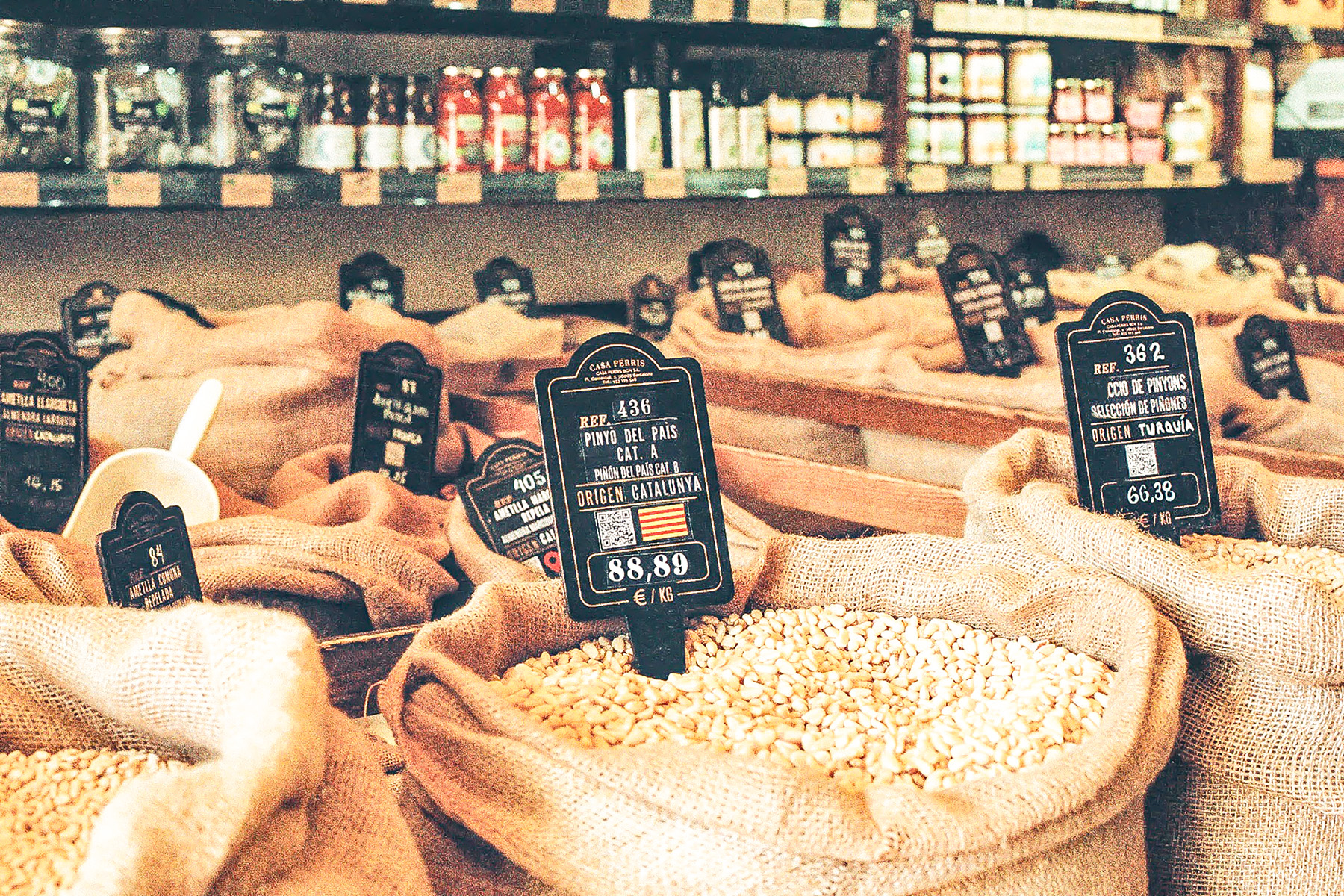
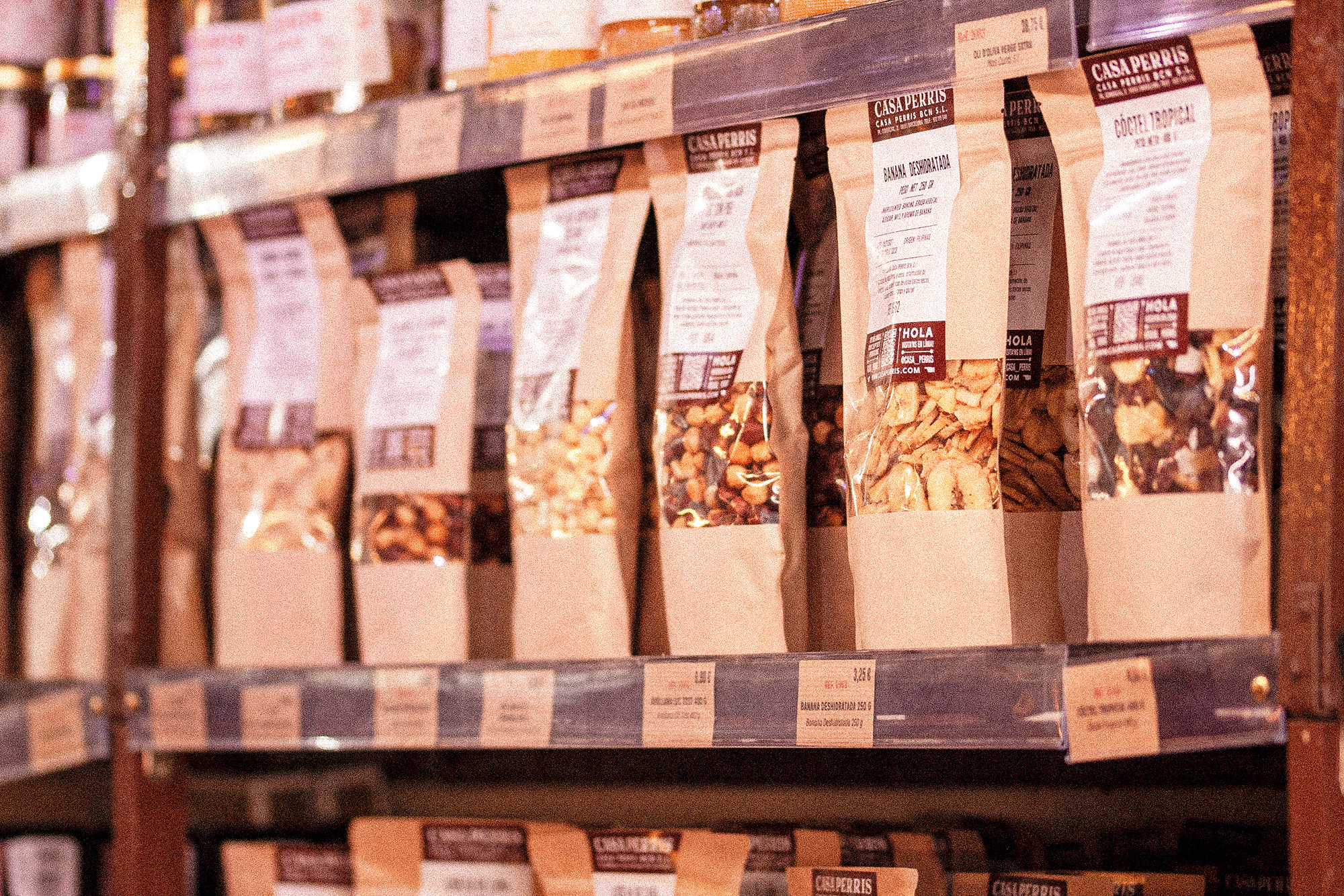
The combination of kraft paper, raffia, blackboards, and wood creates a unique and inviting atmosphere that I believe truly enhances the overall experience.
From the carefully placed prices on the shelves to the thoughtfully crafted bag signage, I’ve strived to ensure that every aspect of the design works in perfect harmony. It’s been a gratifying journey to witness how these elements complement each other, adding a touch of authenticity to the space.
Our focus on highlighting local and ecological products has been a driving force throughout this design process. I genuinely believe in the importance of supporting local businesses and promoting sustainable practices, and I’m thrilled to see these values come to life in the stall’s aesthetic.
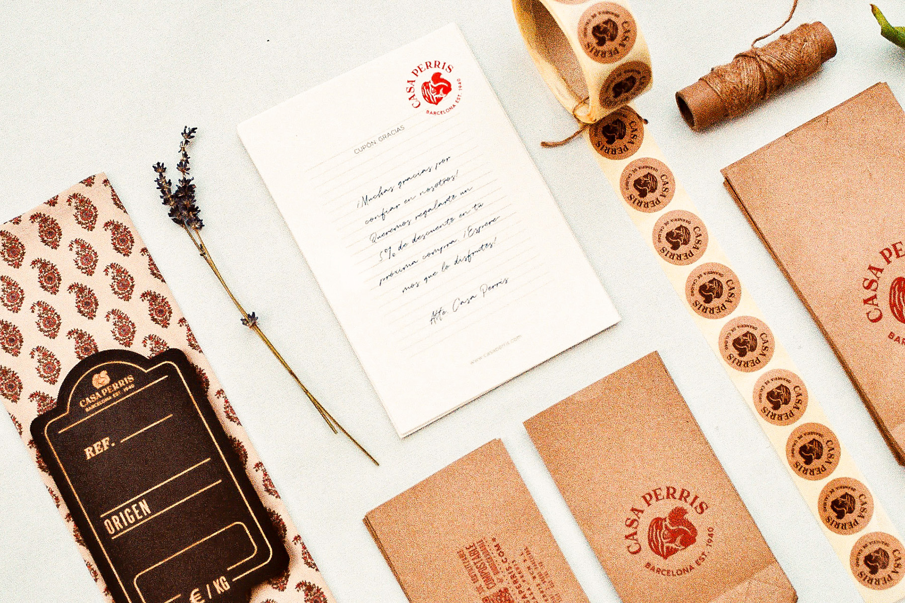
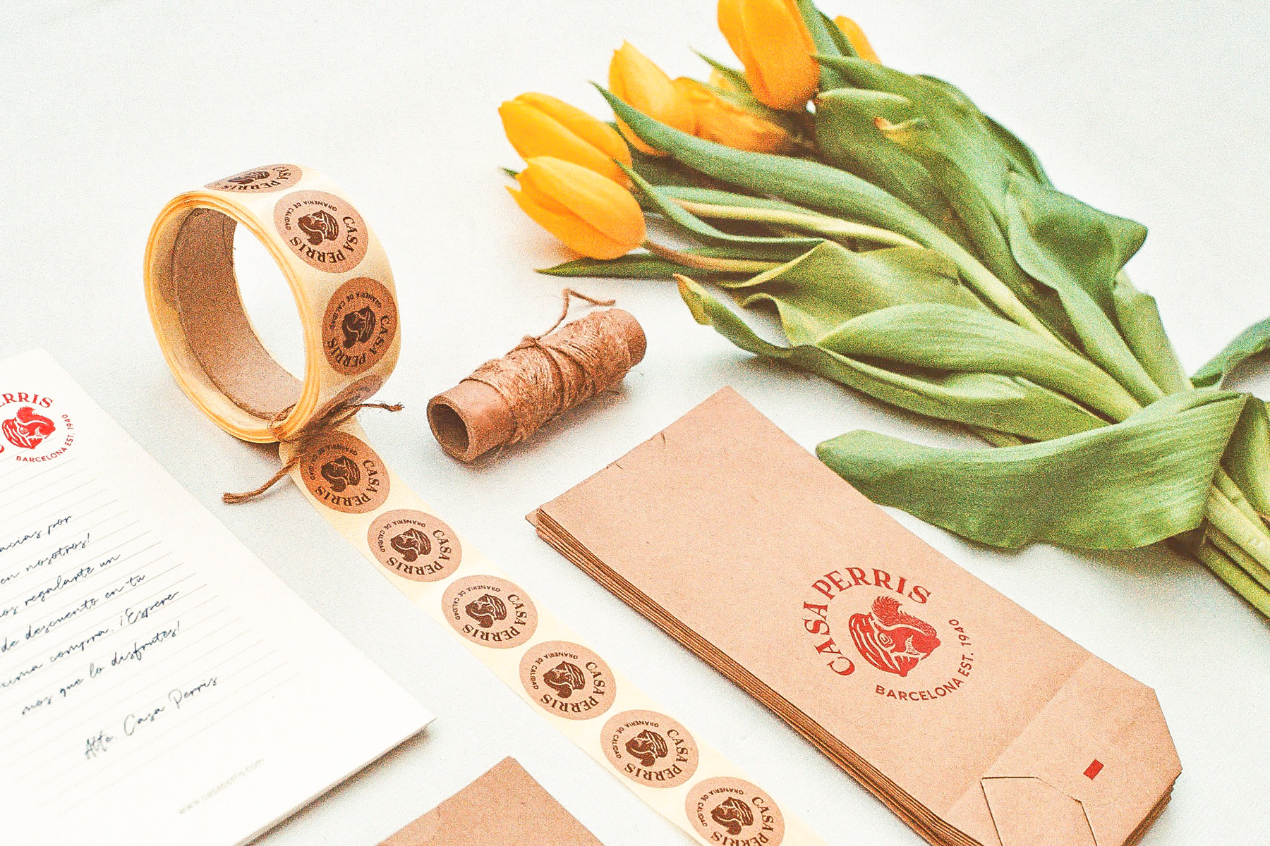
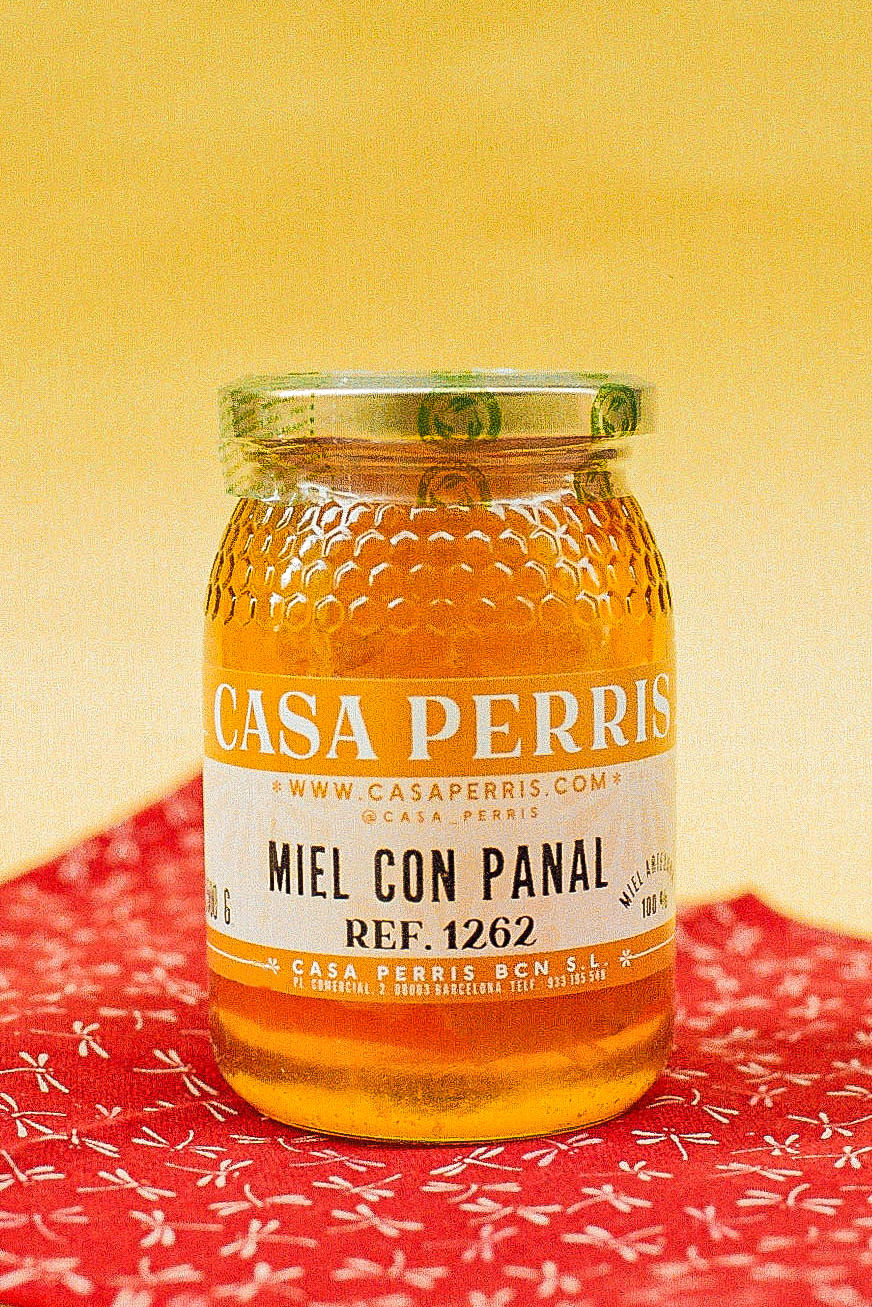
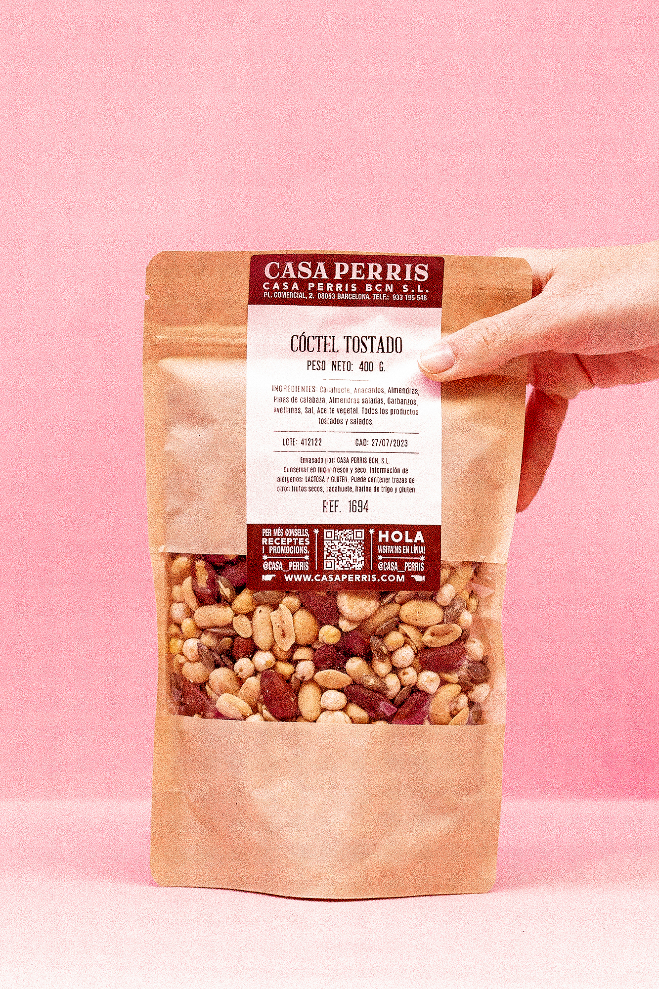
I want to share the story behind our very first stationary set. It was an exciting project where we chose materials that reflected simplicity and authenticity. The combination of kraft paper and black wooden boards, along with the hand-stamped details, gave the set a genuine and personalized feel.
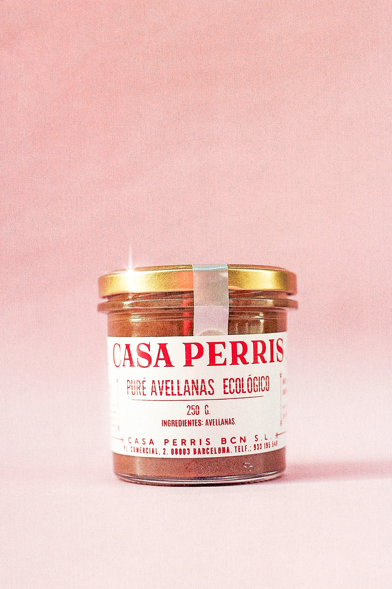
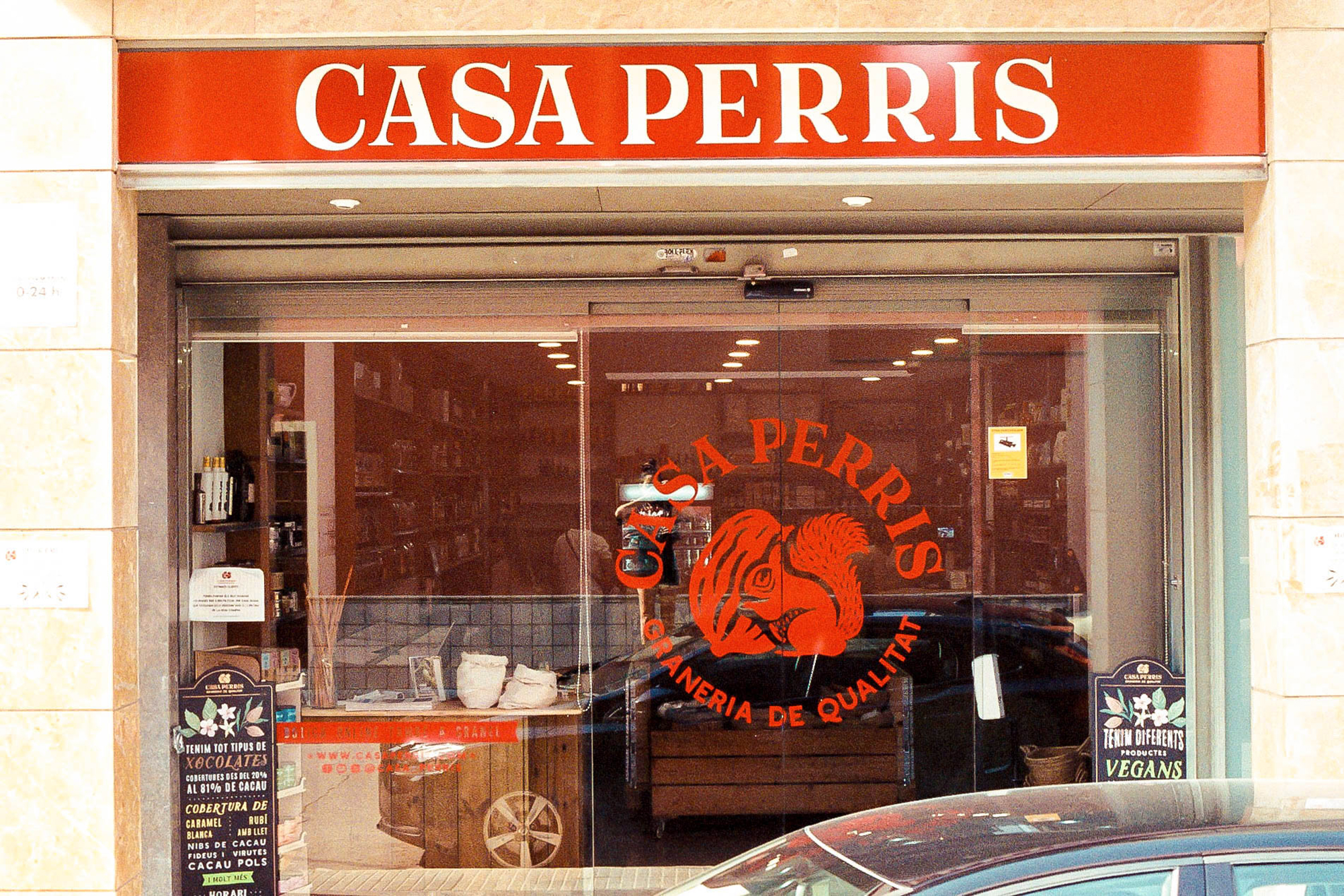
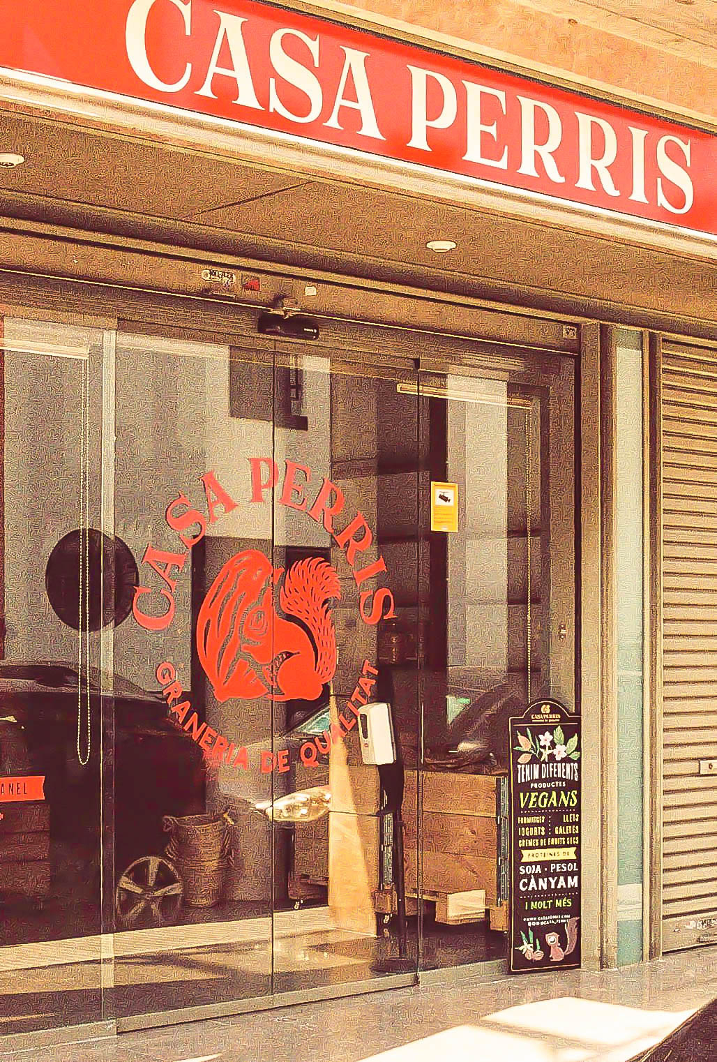
During the design process, we took the opportunity to give the logo a fresh look, incorporating a more modern and refined version. We decided to swap out the old burgundy color for a vibrant and energetic red, which adds a touch of liveliness to the overall design.
As a brand, one of our key objectives is to keep evolving and growing. We want to be an organization that stays relevant and resonates with people of all generations. Your feedback and support are crucial in helping us on this journey, and we are eager to learn and improve together with you.

